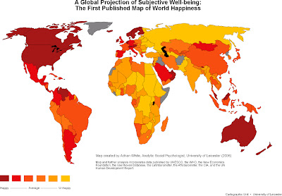
The map was made by Adrian White, an analytic social psychologist at Leicester University's School of Psychology in the UK and it attempts, according to him, to measure "subjective well-being."
It is unclear, and somewhat doubtful to me if he actually talked to anyone in any location in the world. But the map is apparently derived from data from the following sources: UNESCO, the CIA, the New Economics Foundation, the World Health Organisation, the Veenhoven Database, the Latinbarometer, the Afrobarometer and the UNHDR. Supposedly this information comes from 100 some studies interviewing over 80,000 people worldwide.
So, how does one statistically measure happiness? Well this guy proposes that the national level of joy is related to health predominately, followed by indicators of wealth and education. So it shouldn't come as any surprise that Denmark and Switzerland come out on top of the rankings. Or that beloved Burma is almost at the bottom.
Alternatively, this study could just be telling us that Denmark and Sweeden are rich and have great social services, whereas people in Burma are poor, with little access to health and education. But wait, we knew that already.
Its kind of crude, by my thought is to look at suicide rates to see who's happy. It's not an exact measure. A great many people live with unhappiness who would never kill themselves for a great many reasons. Anyways, the Map of Happiness tells us that Canada and the US are pretty happy. Yet I'm noticing that for countries where World Heath Organization statistics about suicide are available, Australia, Canada, New Zealand and the United States are pulling in at positions 26, 27, 28 and 29 respectively in list of the top 81 countries where people comit sucide. (Australia:21.5 per 100,000 people; Canada: 21.5 per 100,000 people; New Zealand: 20.5 per 100,000 people; Sweden: 20 per 100,000 people; United States: 19.8 per 100,000 people)
It seems like although people may be less happy (according to the map) in Tajikistan (#63/81), they tend to kill themselves a lot less often there.
And then there are those poor people trapped in the distant north. They are always committing suicide. Why? Because they are unhappy? They tend to be unhappy because they don't get enough sunlight in their brains. I wonder if the Map of Happiness took that into account. What kind of equation is balancing out all these correllations: the relationship between happiness, health, wealth, education and access to sunlight?
What kind of person funded this research anyways? I can think of ways to make a lot of people happy that wouldn't take nearly so much money, I bet. Sheesh!


No comments:
Post a Comment